Home
Home
Home


Project Type
UX Design, UX Research, Service Design, Innovation
Sector
King county Metro
My Role
User Research, UI / UX Design
Project timeline
12 weeks
Team members
Charlie Landefeld , Michelle Northfield, Raghav Sharma,
INTRODUCTION
Why this project?
-
Over 60% of workers, staff, and students in UW travel using public transport, mostly the King County Metro Bus. However, the major concern is the bus's safety and reliability in commuting to work, which occurs through lack of information.
-
Our team intended to address this issue by supporting commuters with an information delivery system for all commuters of Bus to enhance the feeling of reliability and safety
We started with this question:
How might the public transit commuting experience be improved for passengers new to Seattle?"
THE FINAL DESIGN SOLUTION
How did we get here?
We researched to understand the following questions
-
How is metro transit utilized for commuting?
-
Why do people commute via metro bus?
-
Are metro bus commuters satisfied overall?
#1 Online Survey (38 responses)
We also conducted an online quantitative survey through interactive posters and stuck at the bus stops on the UW campus among the bus commuters to elicit data from a larger, more diverse population.
In the survey, we included questions regarding their bus travel schedule like the number of transfers they take, frequency of travel, distance traveled and their concerns during the commute


#2 Contextual inquiry (n=4)
We conducted a contextual inquiry with the goal of
-
discerning users’ thoughts and deliberations while in the context of taking the bus for a commute
-
How thoughts and deliberations give clues to their use and pain points during a bus commute

#3 Secondary Research
We conducted secondary research to understand if the problems we found were prevalent and what was the public's perspective on the matter. We focused on finding published articles, as well get an idea of the demographic of the population who are facing the problems

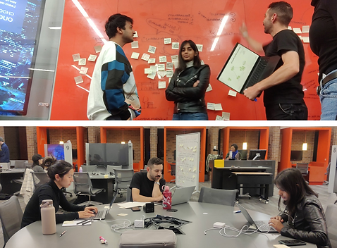
#4 Affinity Mapping
Additionally, as a method of analysis, we constructed an affinity map. Using the data from all three research methods, we organized our insights into similar themes and identified where patterns developed.
This was primarily completed to ensure project-wide visibility and cohesion for the analysis, as well as to make all team members aware of the results learned from each method.

What we found from research?
During our initial generative research, in both our qualitative field interviews and quantitative online survey, we learned that late bus, information, and safety were the three areas that demanded the most improvement in.
Factor #1 | Late Bus
Many users expressed late buses as a common issue to deal with. The late buses non only affected their schedule but leave them with uncertainty in the bus stop
Factor #2 | Information
Although there were third party apps like Google Maps and Trans Loc available, users mentioned that they were un-reliable and in the case of no device, they feel lost
Factor #3 | Safety
The users expressed that late bus + lack of information in the bus stop led to the feeling of being unsafe since they had to wait with uncertainty
Now that we know Information is needed
How do we convey the information?
#5 Follow up survey
We conducted a follow-up survey with the participants who replied to our online survey and asked them the best method and modes we could covey them the information about the bus delay system

76.9%
Preference #1
Live update map
61%
Preference #2
Displayed at
bus stop
54%
Preference #3
location-based notifications
This led to our final design question and goals
How might we empower UW students who commute via King County Metro bus with information?
Know our users
Building personas helped us understand the diverse user group and their specific pain-point. We summarized our users into 3 persona categories.

.jpg)

Ideate
The design goal of “accessible to users without smartphones” was the biggest conduit towards a physical solution at the bus stop. This addressed concerns for accessibility, responded to pain and joy points discovered in the research, and was within a reasonable design scope.

Validate
We went through all the ideas and the goal was to concise the idea to one goal.
The goal was to convey information without the help of a smartphone
Let's Design it!
Mid - Fidelity Design
Settling the design question, goals, and eliminating variables led to the creation of the Bus Beacon. The framework for the final design — an illuminated pole with information display — was proposed at this stage.

Usability testing
The first usability test was conducted with a 1:1 scale paper prototype of two different display options. Held in rapid succession, five participants were given a scenario and asked to walk through their thought process.
Usability testing provided three key insights that were incorporated in the final design:
-
Preference for both visual countdown cue (dotted line circle) and HH:MM time format
-
A desire for “hash marks” of time and consistent scale of time increments
-
Clarity of expected result when scanning the QR code


We built a physical model of the design to get a real idea of how the interaction can work. We showcased the design and got the final feedback
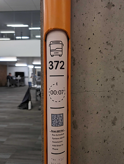

Final Design : Key Features
Light rises up as the bus arrives

QR code for additional info

Used colour coding for different routes

A chime 20s before bus arrives

Impact + Takeaways

-
Service Design v/s UX, the project design has the potential to go beyond screens yet serve the User Experience
-
Leverage on diversity, work was divided based on the USP of each group member
-
Universal Design Thinking: When designing in a public space, we must accommodate the diverse population
We received attention from King County Metro - the public transit authority of Seattle, and had the chance to pitch it to their Innovation department.